Data is an incredibly powerful resource for any business, nonprofit, or organization hoping to better understand their own services and impact, and the more data you have access to, the better. But there comes a point where the data collected can become overwhelming, and it can be unclear what the data is communicating and what to do with it.
Data visualizations play a crucial role in understanding and communicating complex information — like entire databases, especially those containing large or intersecting stores of data — effectively, making it easier for nonprofits to identify patterns, trends, and outcomes of specific instances or actions.
If your organization has collected and stored data relating to your activities and outcomes, you’ve already taken the first step toward making data-driven decisions to benefit your community. The next step is to turn these data into easy-to-digest visualizations that help you set and meet goals for the future.
Below, we explore some ways your organization can leverage data visualizations to turn insights into plans of action.
Types of Data Visualizations
In its rawest form, data fills tables with columns that symbolize categories of information. These tables are very useful for locating specific instances of data.
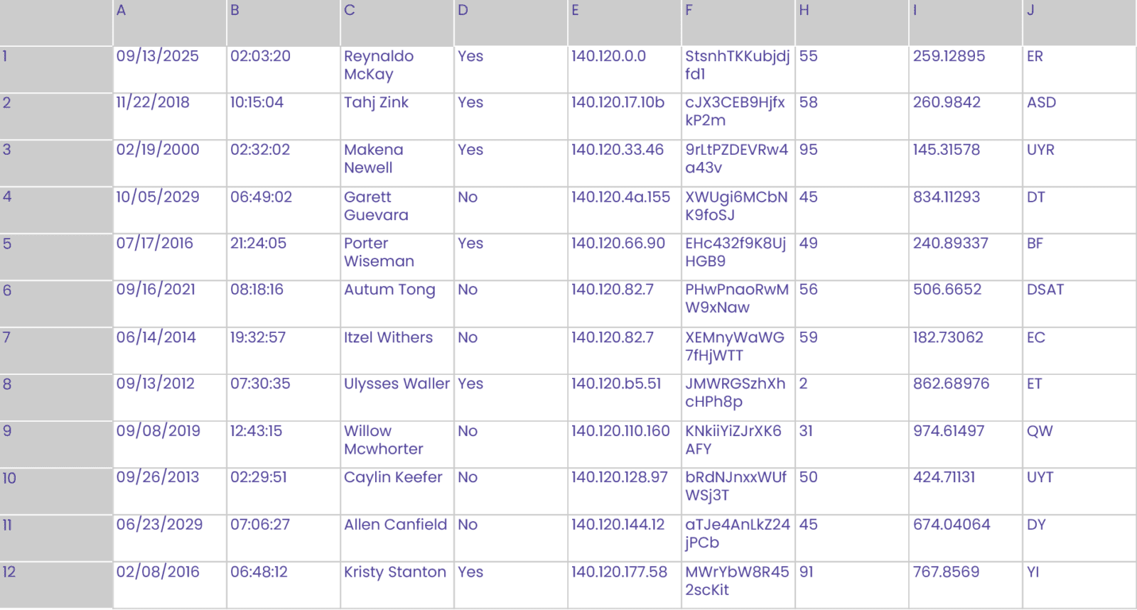
But these tables are not helpful when we want to look at a large amount of data collectively. That’s where data visualizations come into play.
Data analysis doesn’t have to be as complicated or as technical as it might sound, especially if you can distill your findings into easy-to-understand charts, maps, and graphs. Anyone that has looked at and understood a pie chart has seen and learned from a data visualization. Without these visualizations, data can be overwhelming, murky, and indigestible.
Some of the simplest, most beneficial data visualizations that organizations can use to illustrate and understand data include:
Pie Charts: Measuring Percentages
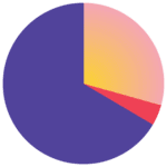
Pie charts represent data as slices of a circular pie, with each slice representing a category or proportion of a whole. They are suitable for showing the composition or distribution of a dataset. The area of the circle covered by each category represents the percentage of the whole that falls into that category.
Pie charts are very popular for analyzing finances: How much of our funding comes from which sources? What kinds of expenses make up most of our costs?
Bar Charts: Measuring Relative Amounts and Frequencies

Bar charts are some of the most common data visualizations we encounter in our everyday lives. They sort data into categories and use rectangular bars of varying lengths or heights to represent and compare the relative amount of each category. Unlike with pie charts, bar charts can compare variables that aren’t pulled from one universal data source.
Bar charts are helpful in categorizing and communicating demographic information: How many of our clients are female, and how many are male? How many of our clients are children, adults, or senior citizens? Which income brackets do most of our clients fall into?
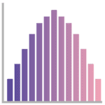
Histograms: Measuring Changes in a Single Variable
Bar charts are some of the most common data visualizations we encounter in our everyday lives. They sort data into categories and use rectangular bars of varying lengths or heights to represent and compare the relative amount of each category. Unlike with pie charts, bar charts can compare variables that aren’t pulled from one universal data source.
Bar charts are helpful in categorizing and communicating demographic information: How many of our clients are female, and how many are male? How many of our clients are children, adults, or senior citizens? Which income brackets do most of our clients fall into?
Line Charts: Measuring Relationships Between Trends
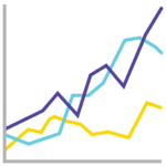
Line charts display data points connected by lines, illustrating trends or changes over time. Line charts plot specific data points and connect them with lines to symbolize the changes that occur between the points. Plotting two line charts on the same plane can help us understand relationships between data sets.
Line charts can help us identify causes and their effects when the lines formed by two data sets are parallel or close to parallel: workforce development services provided and job offers received by clients would hopefully have a clear correlation. Conversely, a gradual increase in available subsidized housing would hopefully correlate with a decrease in unhoused populations in the community.
Heatmaps: Measuring Geographical Frequencies

Heatmaps use colors to represent the magnitude or density of values across a matrix or grid, often using colors like red to indicate a high frequency, and blue or purple to indicate low frequencies. They are commonly generated using geographical data to show patterns or variations in frequencies. Heatmaps don’t have to be literally geographical, either. Density heatmaps, time-based heatmaps, and correlation heatmaps are all methods of analysis through which teams can visualize frequencies.
Heatmaps help us understand where resources and personnel are most needed in our communities. A shelter network might use heatmaps to see which shelters are most densely occupied and might need to expand.
Using Data Visualization and Organizational Goals to Develop Actionable Insights
Data visualizations reduce huge bodies of data to single, simple insights, and the same data sources can be interpreted in many ways to produce many insights. Data can be interpreted over and over again, with old data constantly providing new insights. And different visualizations from the same data can be combined to build powerful reporting dashboards that communicate multiple metrics within one hub.
Actionable insights have the potential to guide decision-makers towards specific actions that can deliver tangible results. These insights are typically clear, specific, and relevant to the goals or challenges of the organization as a whole.
By viewing real program data through the lens of the nonprofit’s mission statement and goals, program directors can develop initiatives, strategies, or even individual steps to optimize processes, enhance client experiences, reduce costs, or increase the reach and impact of the organization. After establishing a baseline, decision-makers are able to determine what metrics and key performance indicators (KPIs) would indicate success in the future.
Each nonprofit’s data, goals, and approach are unique, so we can’t tell you exactly what to do with your data. However, data analytics can make the recommendations you need for your team.
Here are some common examples of actionable insights developed using program data:
Financials: Fund Allocation by Program
Nonprofit organizations often have to project and measure their own performances through impact reports and grant reports, with particular attention paid to the financial aspects of their work. Whether an organization wants to sustain itself and its work into the future, or expand its reach by boosting fundraising efforts and bringing on more staff, financial data often tells organizations what they are achieving, and what might be within their means.
What your data is telling you: Thanks to increased grant writing and fundraising efforts, your nonprofit organization is on track to have 50% more financial resources available next year.
Action to take with this insight: Because the nonprofit will have more finances, they are in the position to expand their services. They might hire more staff, increase the number of individuals they serve, or purchase and distribute more resources to clients.
Program Participation: Increased Demand for Services
Growth trends can help us anticipate what resources and personnel a nonprofit might need in the future. If enrollment and participation in a nonprofit’s organization is growing, that is wonderful evidence to present to stakeholders and funders to ask for help before the program is overburdened and clients are left with nowhere else to turn. Trends and projections give decision makers time to gather resources at the most appropriate time: before they’re needed by the community.
What your data is telling you: Community Action Programs (CAPs) provide financial resources to individuals and families in crisis to pay for food, power, water, and more. As a community grows, its vulnerable populations will, as well. According to growth data from the past two years, one city-funded CAP is projected to have clients in need of 45% more financial support, year over year.
Action to take with this insight: This information can be shared with grant sources, nonprofit partners, city officials, and more, so the community can band together to gather more funds or, better yet, come up with holistic solutions that can uplift communities along with the city itself.
Geography: Program Participation by Location
When we try to figure out where to spend our time and money, sometimes the answer is a literal place. Understanding where your clients live and work can make your programs more accessible to those with transportation needs. Knowing which location serves the most clients can help with planning and resource allocation. Knowing where fundraising is most effective can help nonprofits target individuals who are most likely to donate.
What your data is telling you: A city-wide program supports low-cost healthcare clinics in four communities — in the east, west, north, and south quadrants of the city. The eastern clinic sees significantly fewer patients and provides fewer services than the other four, while the northern clinic sees far more patients than any other clinic in the program. Demographic data also indicates that most of the program’s residents live in the northwestern side of the city.
Action to take with this insight: Rather than spending program funds on operating an entire building with healthcare providers and staff at the less-trafficked eastern clinic, those funds could be used to support the overburdened northern clinic and operate a shuttle service from the eastern clinic’s community to the next-closest clinic.

CaseWorthy Can Collect and Visualize All Your Data Points
CaseWorthy has been working with human services organizations, nonprofits, and case managers in every sector for years. We’ve seen firsthand just how powerful accurate, up-to-date data can be in changing the lives of clients and entire communities.
We’ve built CaseWorthy to record data and address needs at both the micro and macro levels because the two are always connected. And we’ve built our platform with PowerBI embedded to connect multiple data sources with the click of a button. PowerBI can generate dynamic displays to reflect your constantly changing data in real-time, so your organization can share up-to-date information with other organizations working toward the same goals.
CaseWorthy offers a custom portfolio of report templates that your organization can use at any given time for any need: financials, participation, fundraising, marketing, and more. Use our templates, or build your own — either way, we make data easy to ingest, organize, learn from, and act on at every level of your organization.
If you’d like to learn more about how easy it is to understand your data, contact us. We can show you how simple it can be to learn from your community every day.

